What Makes A Great
Ecommerce Website
You are reading this because you want a great eCommerce website or have one and it’s not performing. Every e-commerce store out there is fighting for the attention of consumers. Whether you operate in the clothing industry, tool industry or you sell your own jewellery, having a great eCommerce website that stands out is crucial.
There are countless designs available but there is a fine line between getting your store right or wrong. The entire experience for consumers has to be one that is both efficient, pleasing, and simple because shopping online is all about convenience.
So, whether it’s the colours, the design, the layout, the ease of browsing as well as the information available, you have to get it all right to tick every box and deliver an experience that delivers value but also creates loyalty.
As a leading Web Design Surrey UK agency, we dig deeper and explore the essential eCommerce website features.
What is a Ecommerce website
We bet you have purchased online via one of these ways:
- Shopped on Amazon
- Secured car insurance
- Bought a shirt from your favourite fashion house
- Used Moonpig to send a birthday card (because you forgot your Dads birthday)
- Booked a hotel room or holiday, or
- Ordered groceries online.
These are all online shops, selling a service (insurance) or product (fashion, makeup, food).
E-commerce websites usually start with a front page – the shop front, loaded with a product selection – the shelves, and then finally the cashier – in this case an online transaction.
Great eCommerce websites (shops) are usually very savvy with product page SEO. They also have seller and buyer payment protection systems in place to accept varied transactions.
Every consumer in every country across the world from 2020 has been forced into online shopping. It’s a convenience, or hassle whichever way you look at it, that is here to stay.
Their demands and expectations have heightened. They want the buying process to be fast, secure and communication with the sales team (you) to be smooth.
Great E-commerce Websites Provide Product Customisation
To back up Moonpig a little, you can see why their website is a major success. It’s not people leaving it to the last minute to sort a late birthday card. Rather it’s the customisation it empowers you with.
Family photographs, changes in card greeting messages are all ways to make the card a truly personal experience for the recipient.
Moonpig attracts just over 3M visitors a month and is a major brand that dominates. Funkypigeon will come second with 1.5M visitors per month.
However, a strong all-rounder, working with over 5000 UK businesses will provide unique personalised gifts, is notonthehighstreet.com. 3.6M visitors will use this site regularly.
This website has to be held as best practice for any other e-commerce site that adding personalisation is a winner. The more you make the product exclusive, the improved chances of word of mouth and branding awareness.
Great Ecommerce Websites Have Good Web Design
Visitors to your store have expectations and they are primarily focused on a pleasant experience that’s hassle-free.
UX Design is vital because you want to ensure that you deliver the right messages and capture their attention with visuals. First impressions count and this is especially true when it comes to e-commerce.
You need to meet their expectations instantly by delivering a good design layout, with a clear balance of page direction – navigation. On balance Apps or Website design can deliver this instantly.
With good design comes ease of use and this is vital to consumers as they consider it to be one of the most important elements of any website.
The aim of your website is to help consumers find what they are looking for in the same way as you would in a bricks and mortar store.
You have nothing more than a matter of seconds to win them over or lose them to a competitor, it really is that cut-throat.
Check each product page bounce rate and that will give you some idea of how ‘sticky’ or not your product page is.
A user-friendly design will entice consumers into browsing your products and all of this can be done in a number of simple ways below.
Top E-commerce Websites Have Great Search and Navigation
A steady rule for any ecommerce website designer is to make sure every product is no more than 3 clicks away.

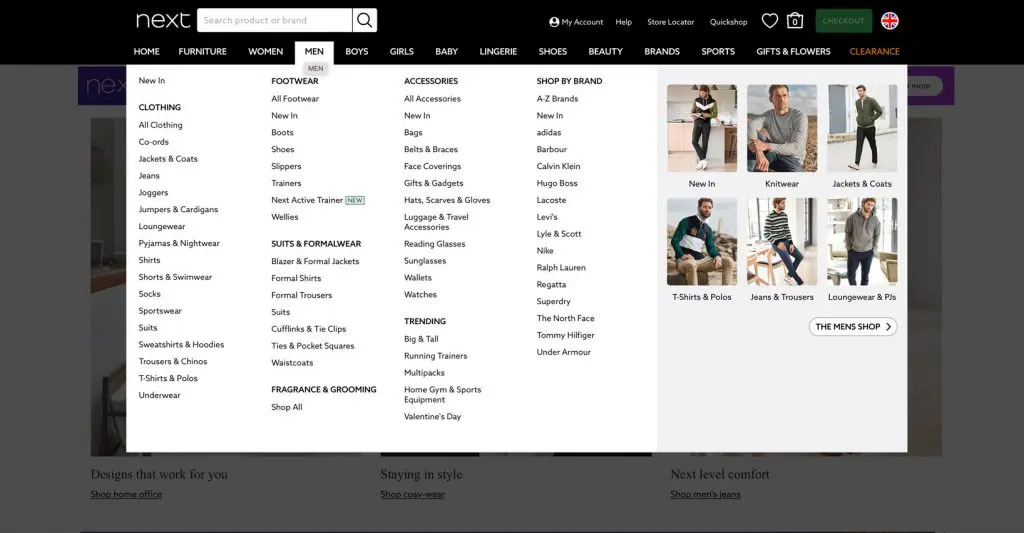
For example, the high street is fiercely competitive and so are their retailer online shops. See how Next, has an easy to find selection through the funnel of men’s clothing. This a clear example of one of the best ecommerce websites.
You should avoid step after step of menus if you have a large product selection. Keep it easy to filter down to find the simple things, like socks!
Aim to deliver a user experience that’s far superior to that offered by your competitors.
The search function of your store has to be perfect. An autocomplete option can help as this not only makes things faster but it makes it easier for consumers to find what they are looking for.
Visual navigation is a clever way of showcasing products but also assisting people to find the items they want. The entire experience should essentially solve a problem for consumers, which is to help them find what they are looking for instead of delivering a frustrating experience.
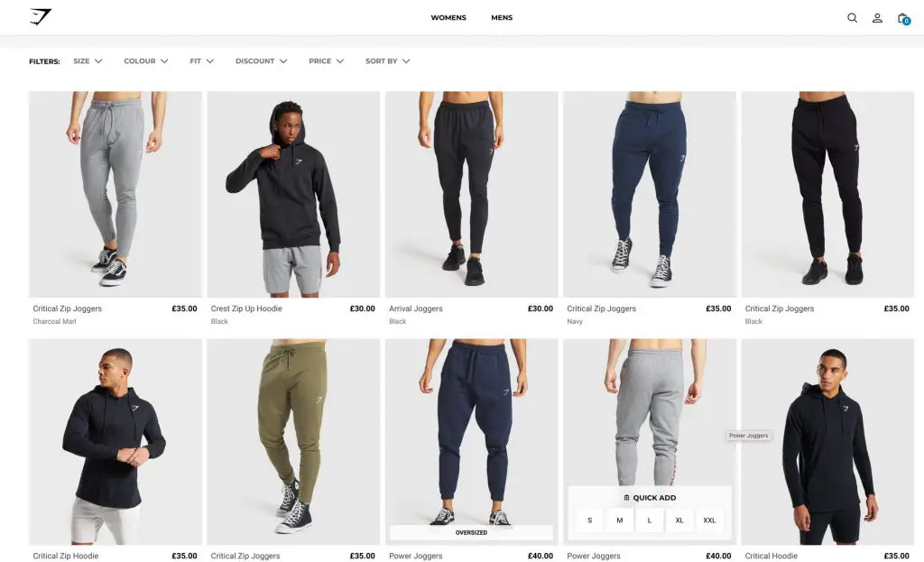
A simple execution is how Gym Shark, on their Shopify site, help users to filter product whilst remaining on the same screen.

Navigation is a key element of creating a seamless experience. With categories easy to find and work through, you can help consumers get to the right area of your website. If they have to go through many categories and menus to find what they need then they’re going to lose interest.
How many times did we write easy or simple on here? Thats just how an ecommerce page should to be.
Great Ecommerce Websites Show High Res Images
Think that your images are there as a token gesture? It’s time to think again! Consumers make decisions with their eyes and if a high-resolution image captures their attention then they are going to want to know more about the product.
Ultimately, it is not the finer details that hook them but the image instead. Maybe then they will read your description.
Shoppers are also not satisfied with one high-quality image. In fact, they are looking for multiple angles and even zoom so they can see the product as much as possible.
Have you ever bought clothing online, only to receive it a week later with a surprise logo on the side which you did not want?
Think about hiring models to wear your outfits. Don’t just show a jacket on a mannequin. Display your paintings in living quarters, or show a TV on a living room wall. These are ways to aspire consumers to the style of life you are selling.

Turn around visuals, 10-second video content, are other ways to make the purchase decision more informed and more confident.
You will need to consider the technical aspect of images too. Sure, having high-resolution images will tick a box but if they cannot see those images because of slow loading times then your store is going to struggle. In fact, if your images take time to appear then this can lead to a huge drop rate.
Along with all of this, it is not just professional images that will make a difference because Instagram images are now also being considered important as they can increase sales by 24%. So, the reality is that images sell products, not text.
Top Ecommerce Websites Use Google Ads
To Increase online sales PPC and Google Ads provide a fast start to any eCommerce ROI. Combine this with using a Google Merchant Centre account, a website can combine Search Text Ads with Shopping Ads.
This explosive measure of optimising Ads Sets and covers all bases to achieve optimised click-through rates and conversions.
At the end of the day, you are set up for sales out, your business has inventory and it needs moving. SEO takes time to kick in if you are not a niche site, therefore Paid Search is that steroid to elevate your Google Serps position to Page 1.
To improve your Google Ads knowledge try out this very relevant blog on how to learn digital marketing.
Great E-commerce Websites Are Mobile Friendly
Did you know that around 50% of online transactions take place on a mobile device?
A responsive website that is mobile-friendly will ensure your store is accessible from anywhere, at any time, and on any device – that will increase chances of potential sales.
This is all about accessibility and user experience because users don’t have time to visit non-mobile-friendly sites, the experience will frustrate them.
Whatever your business size, to develop an effective ecommerce website, you must invest in search engine ranking. Appeal to users with a website design that puts user experience + navigation first. It’s all about creating that immersive mobile-friendly experience.
From 1st April 2021 the new Google algorithm will be promoting fast mobile responsive sites, so be prepared. That too with city-wide 5G connection, mobile transactions will continue to increase.
Customers prefer going back to ecommerce sites for brands they trust. It’s faster too due to “use last credit card number “, it’s like click and go.
Best Ecommerce Websites are Secure with SSL Cert.
Being trustworthy is one of the most important things when it comes to owning an online store.
It’s no use assuming that consumers will accept good design and user experience as proof of trustworthiness.
Almost everyone is carrying out transactions online but e-commerce stores can become a target for cybercriminals and that puts consumers at risk. Therefore, you should do everything you can to protect them and keep their personal information safe.
WordPress is very good for ecommerce website development and can be combined with many safe payment platforms, such as WooCommerce. There is also Shopify or Magento, they all come with security features as standard. However, it’s important to make sure that consumers are informed of what you are doing to protect them.
Therefore, you should consider the following:
SSL Certificate – This helps to create a secure connection between your users and your website. This can be identified through “HTTPS” or a padlock in the address bar. While you can opt to use any vendor of your choice when purchasing an SSL certificate, it is important to use one that has a good reputation.
Two-Factor Authentication (2FA) – This provides an additional level of security by requiring the likes of a username and password to access the site as well as something such as a security code or even fingerprint recognition.
A Clear Privacy Policy – You cannot assume that your visitors will instantly identify all the security protocols you have put in place. As a result, you should make your privacy policies clear and accessible in the footer of your store.
Top Ecommerce Websites Have Flexible Payment Options
Consumers are not interested in a payment process that is clunky and time-consuming.
They want to be able to do as little as possible when it comes to making their payment and parting with their cash. Therefore, you should place a focus on ensuring you achieve this with minimal fuss.
From the moment they checkout, there should be as few steps as possible for them to overcome in order to make their purchase.
If possible, give them the option to store their payment details but be mindful that this will have to adhere to laws and regulations while you will need to make sure that their details are stored securely.
Returning customers will then be able to click a button and make a purchase without the worry of having to input their details each time.
Next up, you will need to offer as many payment options as possible because people now pay in many different ways.
Apple Pay, what a dream this is! You can also use standard credit and debit cards but what about online wallets such as Paypal and Worldpay? Can you offer them to make it even easier for customers?
If your website limits payment options then you can be sure that potential customers are likely to look elsewhere.
Great Ecommerce Website Promotions Challenge Retail End Caps.
Promotions are something that consumers love but there is a fine line between getting them horribly wrong and right.
Keep your promotions simple. The more complicated the message, the less the uptake. Standard retail promotions such as 20% or 25% work strongly for one SKU only.
However, if you want to attract consumers to buy more than one, then find ways to offer a 2for. This attracts the customer to buy deeper into your range.
Whatever promotions you see down the retail aisle i.e. end cap, or cardboard FSDU, can still work for ecommerce websites.
There are many ways in which you can achieve this and this is where the boundaries can lie. You can opt for pop up messages where you might offer random customers money off or a special offer.
You can also ask them to sign up for your newsletter to receive a certain percentage off their first purchase.
Once again, these pop-ups can become a pain to those who simply want to shop and leave, so if you do opt for this approach, keep it simple, and lessen the frequency of the sales push.
You could also promote special offers on your website which are only actionable should users want to make them actionable.
This could be as simple as stating that orders made by a certain time will benefit from next day delivery and so, you have the scope to tailor your approach based on your needs but also your customers.
Great Ecommerce Websites use the Power of Social Proof
When brands turn to social media, they are increasing their potential of connecting with buyers on a whole new level and they build strong lead generation.
They have the scope to understand their behaviours, tailor campaigns and engage with them, all of which helps to build trust and loyalty.
When businesses form relationships with consumers, they can entice them with specialised offers and even interact with them by engaging in conversations.
From posts about the latest products and offers to discuss topics with them, everything that you do will give you authenticity and credibility that will go a long way.
Consumers are always encouraged to take advantage of faceless offers but brands who attempt to engage, and build brand loyalty will see customers return time and time again.
No one likes to be the first customer, so the best ecommerce websites embrace and embed reviews from Google My Business, Yellow Pages, and Trustpilot. They also show testimonials, but these should be limited because they can look a bit spammy.
Driving social media to your website is the perfect way to prevent website inactivity.
Great Ecommerce Website Stores Don’t Overlook SEO
This is a massive subject and cannot be wrapped up in this section. We’ve written plenty of articles on what SEO guides enhance page rankings.
What the major ecommerce websites invest in is SEO for organic search. They place so much attention on their product pages.
We deal with many customers lacking traffic to product pages. Many are not adding researched on-page SEO to the actual e-commerce service or product page. They focus too much search engine optimisation on the front page.
A mobile friendly store, with keywords, meta description, headers and long form copy is just as important as they are on your front page.
If you want a good eCommerce website then SEO is vital. Ensuring you have landing pages for key products will also help you rank higher.
All of this will help you to generate a profile and an identity that gets you recognised by search engines and that’s what our SEO Surrey agency can do for you.
Great Ecommerce Websites Are Contactable
When consumers can easily find all of your contact information, you are going to build trust.
Consumers like to know how to contact you should they have any queries, returns or problems so don’t hide your contact details.
Make them clear and provide them with plenty of options to get in touch such as a telephone number, email, and online form, not forgetting an address too.
In addition, make sure your Twitter and Facebook icons are clear so they can send an instant message. WhatsApp is also very user friendly and gives a sense to the customer that the message has been delivered successfully.
Make clear your return policy in an upfront friendly manner, don’t force the customer to read the T&C’s.
The whole process of shopping should be considered an experience for consumers. Therefore, you have to ensure that you make the entire process one that they not only enjoy but one that is efficient, simple and enjoyable.
As a result, a strong e-commerce WordPress website design gets everything in place to make sure every box is ticked to keep consumers satisfied.


