How Has The Google Logo Changed ?
The Google Logo –
What Is The History Behind It?
The Google logo is everywhere and marked in history. Whether we’re working at a desktop PC or searching for the nearest restaurant while out and about, it’s safe to say that there is no getting away from it.
It has become a part of life and although there are other search engines out there when someone mentions the words “Search Engine” almost everyone thinks of Google.
Unbelievably, Google is now in its third decade of existence which is incredible when you consider that it’s only in recent years that it has become the go-to search engine.
In fact, back in the day when search engines were relatively new, it had to compete with the likes of Lycos, Ask Jeeves, Yahoo and many others. It effectively came out on top, so it must have been doing something right.
While many choose to use the search engine for its ability to return accurate results, there is something about it that we all notice instantly – its logo.
It’s now one of the most recognisable logos out there but there is a history to it.
While Google might lead from the front in all that it does, it has certainly led from the front when it comes to branding and brand evolution. Since its initial inception in 1998, the logo has constantly changed.
There is no denying that the logo is extremely simple. There is no play on design just a simple word that is matched with simple colours but the two together make it one of the most powerful logos in the world but what is the history behind it?
Google’s Beginning, when was it?
The story of Google dates back to 1996 where Larry Page and his business partner Sergey Brin founded a brand new project known as BackRub. This was a web crawler that was quickly renamed to Google after the misspelling of Googol.
The pair were Stanford students and so, that provided them with the ideal platform from which they could test and trial their new project.
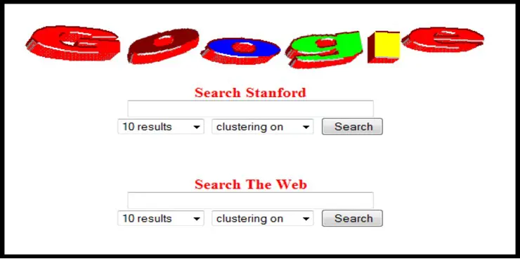
So, as 1997 began, the Google logo as we know it today was born. Of course, back in 1997, digital design was not where it is today which means that looking back, the logo was very primitive although this was not the case at the time.
Little did we know back then that this logo was here to stay and would become a household name.
Essentially, the two PhD students downloaded the entire internet and developed a search program that would allow users to search for anything they wanted.
1998 Google’s Logo, The Beginning Of The Beginning!
It was in 1998 that Google really took off because they Brin and Page both decided to launch Google on a global scale. With a new launch and a new beginning came a new logo and the Google colours that we know and love came to life.
In fact, they even placed an exclamation mark after to mimic the design of their competitor Yahoo!

The logo was actually designed in Microsoft Word which might be a surprise but back then, there were not a lot of options in the way of digital design so they made use of what they had.
Despite this, they quickly moved onto GIMP which was an image editing package and here they started to let their creative juice flow. They used the Baskerville Bold font and opted for a green G although this was quickly changed.
After considering different options, a year later in 1999, they had some assistance with the design.
Google Logo Evolves Moving
On To 1999
As the end of the century was fast approaching, Google started to gain traction and was starting to become the go-to search engine for many internet users. It continues to baffle many businesses that want to rank well.
Despite this, it was still very much in its infancy which meant that its branding wasn’t quite on point or where it needed to be according to Brin and Page.
They were not totally on board with the look of the logo and felt that a change in direction and some professional assistance would help to transform the brand and take it in a new direction.
This meant that they called on the expertise of Ruth Kedar, a Stanford Assistant Professional to help develop logos.
She worked on several designs, made tweaks and changes, and began to shape the brand logo that we know and love today.
While the initial ideas hinted at the basic design of the logo, it seemed as though the introduction of colour really changed the look and feel of the brand.
Marketing is driven by an injection of colour and many of the most successful campaigns around the world have hinged on the appeal and attraction of colour and so, it seemed as though colour was going to become a part of the logo.
They went through eight designs, with each design bringing them closer to the finished look.
They played with designs that incorporated magnifying glasses although that was removed due to the feeling that Google was going to become more than just a search engine – the seed had been sown.
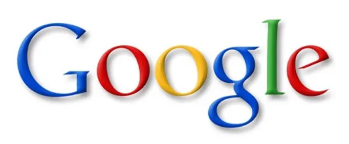
Eventually, after tweaking designs and introducing quirks, it was decided that the basic logo was the one they wanted.
A New Google Logo in 1999
– A New Era

Amazingly, this logo was the one that remained in place for 16 years. It was minimalistic yet playful and enticing. It appealed to the masses and that was seen in the way that Google instantly started to evolve and grow.
As audiences and trends changed, in 2010, the new logo that had been in place for just over ten years had a change. It was a slight change nonetheless but involved the removal of the drop shadow.
A minimalistic logo became even more simplistic but the colours we enhanced, making it even more appealing.
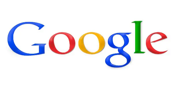
The Google Logo in 2013 Came With More Changes
Staying true to the brand, 2013 saw that further changes were required in order to keep the brand on-trend and up-to-date with the ever-changing technological landscape.
Smart devices were becoming more prominent which meant that Google needed to step it up and become optimised for mobile devices.
As a result, further tweaks were made to make sure that the logo was easily readable and so, it was given a flat shape design. Simple, yet highly effective.
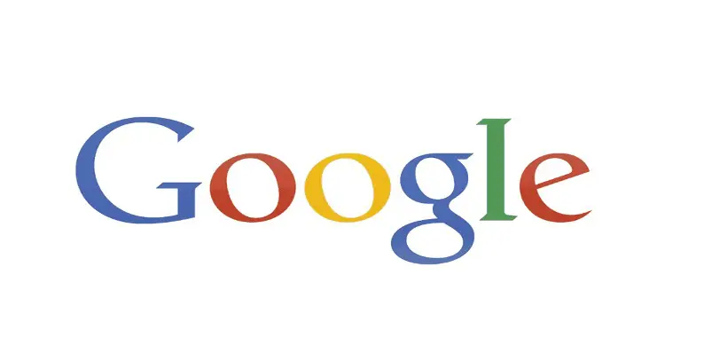
The Google Logo in 2015
– As We Know It Today
Up to this point, the original Google logo had been standing firm for 16 years, proving that Ruth Kedar really did get the logo right.
However, a new era was beginning and the digital landscape was changing and in Google fashion, it evolved to work with all devices.
They still retained the famous colours but it became more of an animated design whereby the font was changed from Catull to Product sans. This gave them the scope to be able to alter the logo whenever they needed to.
In fact, the new logo gave Google a more informal appearance.
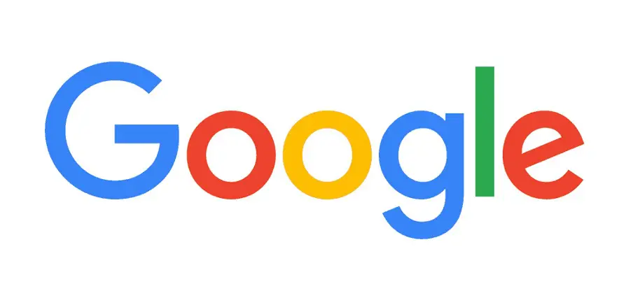
With the number of devices and platforms growing, Google realised that one logo was not enough so several versions were released. This again was centered around mobile devices with the now famous ‘G’ logo being used on their apps.
Again, this streamlined logo might have been stripped back but there is no denying the fact that it’s instantly recognisable due to the colours.
As smart devices started to become smarter, Google decided to create a dynamic logo that would work seamlessly with voice searches.
Again, the four flowing dots have retained the colours but move during the voice search process. It gives Google more of a relatable feel, making it almost more personable and almost life-like in a digital way.
The Google Logo
Seasonal Changes
Its those annual seasonal festivities such as Christmas, Easter or historical “in this day” anniversaries, in which Google excites us with new temporary logos and even interactive Google Doodles.
It still makes browsing the web and searching fun. Google Doodles have now become a part of everyday life almost. It all started with the ‘Burning Man Festival’ Google Doodle back in 1998 and they have continued to use it ever since.
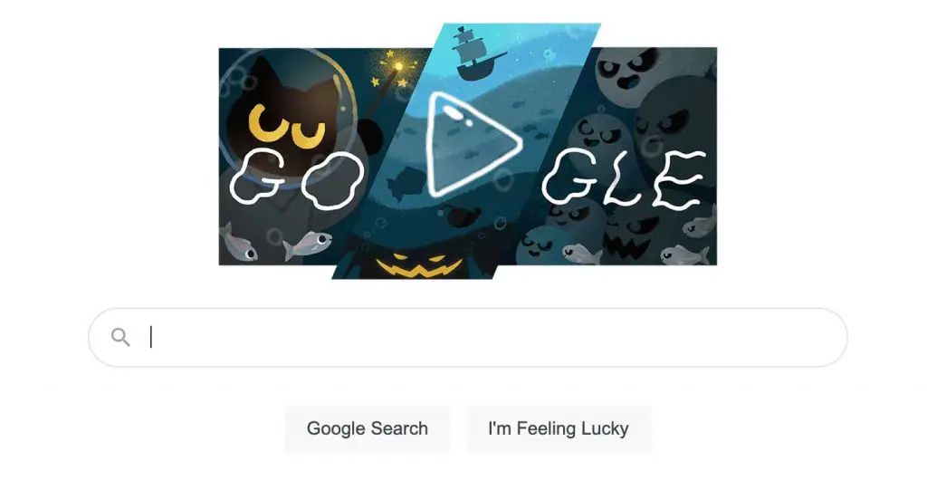
Recently for Halloween, we had this Doodle to play with, by chasing little ghosts away.
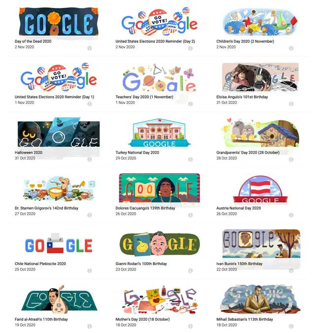
18 Google Doodles from 2020
In fact, Google Doodles has surprised us many times through 2020 (we needed it!) and it should continue into 2021. Below are some of the other creative changes to the Google logo.
The Google Logo
Is An Iconic Symbol
Google has evolved in many ways since it started life back in 1997. It now has a huge array of products and now almost single-handedly drives the whole internet.
The Google logo is still hugely influential in the online world and there are not many people across the globe who will not recognise it.
It’s up there with some of the most influential brands in the world such as Apple, Nike and Adidas but they all have a vast amount of history behind them, proving that Google really has made great strides in getting to where it is today.
A global brand and a logo that is as recognisable as some of the longest running brands in the world. So, we might not see a complete change to the logo any time soon but it’s quite likely that we will see some tweaks because that’s what Google does.
And Hey Google, how about this as your next Google Logo Design? Excuse the chocolate lollypop on the desk!
#homeschooling #futuretalent
With over 3.5billion searches a day, Google is the only search engine you really need to rank for. If you need help with dedicated SEO strategies from an experienced SEO Agency then do get in touch. Don’t miss any SEO opportunities for your business.

